The top 5 CTAs you must have on your website
CTAs are essential to a website's success If you decide to recreate these CTAs on your site. Here are 7 great call-to-action examples to inspire you!
Your website conversions are less than 1%. Do you know why? This article will give you 10 easy ways for your website conversion rate optimization.
Estimated reading time: 0 minutes
You have decent traffic coming on your website, but your conversions are less than 1%. Do you know why?
Maybe your website is not optimized for mobiles or it takes ages to load or worse, the form does not work properly.
How do you figure out the issue and solve it?
This article is exactly that. It will give you many easy ways for your website conversion rate optimization.
A website is your strongest lead generator and most of the time acts as a crucial form of marketing. It is said that a website with a strong conversion funnel (designed by keeping users’ aspects in mind) drives an optimum number of conversions than a website created without keeping users need in mind.
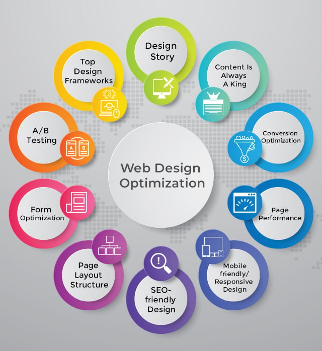
There are seemingly endless ways for website design conversion optimization. For your reference, I’ve accumulated a few tactics that are surely going to help you optimize your web design to gain optimum revenue.
Before you invest time to optimize your website for better conversions, I want to ask –
Do you know what are the top website design optimization techniques to bring enhanced business revenue?
By going through this article, you’ll have complete insight on what are the best website design conversion optimization tactics and how you can implement them to generate quality leads. Use these tactics to make sure what steps you need to follow while optimizing your website for better conversion results.
Have you ever noticed, just after 3 seconds of your website loading, do your visitors able to recognize the purpose of your website?
Do they find the layout of the website friendly and easy to use? Are they find it convenient to navigate through all the existing pages?
If the answer to all these questions is “No”, it’s high time you need to look into the ways you’re utilizing for website optimization.
If you think you’ll succeed by only throwing a captivating design for users, you’re wrong at this point!
Because website design optimization is not limited to optimizing the design and content aspects rather, there are a lot of factors to be emphasized when the target is to increase website revenue.
And if you’re reading this blog, most probably you’re looking for proven ways to improve website conversion rates.
You’ve come to the right place.
So, take a deep breath and invest a few minutes reading the blog. I’m sure when you reach at the end, you’ll get to know the important parameters that can transform your simple business website into a lead generation platform.
#Landing Page Report in Google Analytics
#Google Analytics Search Query Report
#Google Analytics Funnel Report
#5 Mobile-friendly/Responsive Design
#6 SEO-friendly Design – On-page Design Optimization
Let’s start from scratch to have better insights on every web design optimization technique –
Use these steps to see what your traffic is interested in before making any design changes.
Sometimes, you have an idea that your website isn’t performing well but don’t know what to fix and where to start when encountering a problem in web design UX.
Our article isn’t less than an opportunity for web owners who are eagerly looking for assured ways to achieve a web layout designed for conversion rate optimization.
Check out how you can make it happen by exploring the web for a few things –
Heatmaps, as the keywords suggest are the graphical representation of data, shown in a color-coding pattern to display different values. Generally, Heatmaps are used to show a variety of analytic values but moreover, it is widely used to analyze user behavior on specific web pages.
Today, Heatmaps are more likely used to check where users have clicked, for how long they’ve been on the same page and what activities they’ve performed during page scroll.
Implementing this technique would be highly beneficial if you want to know the actual user interaction on target pages.
Benefits of utilizing Heatmaps
You can use Heatmaps to gather data from a large set of users without even leaving your comfort zone. The data you’ll receive is more accurate, representing a large set of users that are more likely to be your audience or prospective clients who are interacting with your website in a real environment.
It’s the best way, letting you know about every activity users have done with your website or particular page. Most importantly, you can see the data in different forms including –
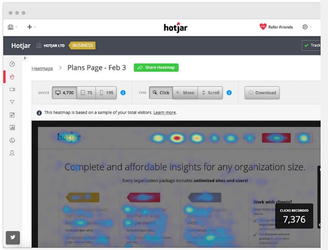
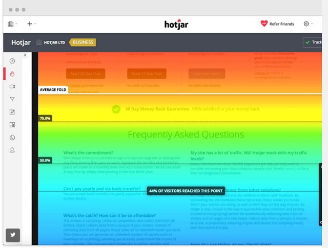
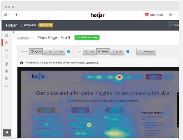
Why Heatmaps are important for conversion rate optimization?
First of all, it is required for marketers as they need bulk data to target customers and also to proceed with further business marketing. Heatmaps show it’s importance in different other areas where they can have an idea of –
How to apply Heatmaps strategy for conversion rate optimization?
Generally, this can be done with Google Analytics and Site Catalyst. But here, you might not be having ample information about user behavior or interaction as these only provide information about the pages users’ have visited.
In this case, use CrazyEgg, Hotjar and Clicktale, the best tools offering well-managed and distributed maps picturizing actual user behavior for the website. You can go for other ones to get these activities done.
Most of the traffic is diverted through the landing page as it’s the entry point for any website. And studying the landing page design report through Google Analytics lets you know a lot about how your visitors arrive on your website and what are the factors they like the most.
Additionally, this landing page report can be further utilized to see how all the pages are performing and how well these pages convert visitors into potential leads or customers.
Post checking all the landing page design factors, if you find the conversion rate less than 2%, then it’s clear that your landing page needs proper optimization.
Where to find landing pages report in Google Analytics?
You can simply access the landing page design report by following the below hierarchy –
Behavior > Site Content > Landing Pages
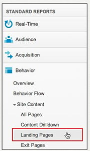
How does the landing page design report used in Google Analytics and what does it show?
As soon as you open the report in Google Analytics, you’ll find the most popular landing pages with the specified number of visitors who have landed on your website for a particular time period.
This is how it will look like –
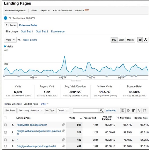
As you see above, the report is clear and displays the landing page traffic data in a well-formatted way.
If you want to accumulate a similar kind of report for your website landing pages, you only need to register with Google Analytics. It’s the place where you can get every information about your landing page traffic.
Apart from traffic analysis, the landing page design report is displayed with a bunch of useful data that you can use to uplift your website for conversion rate optimization.
Additional data you can gather from the report includes –
Search queries fall under Google Analytics which provides data on how your website is performing in Google’s organic search results, i,e., non-paid results. For example, it will display the search results and queries that visitors used to click directly through the website.
In easy language, the stats will show you the results for the best performing keywords of your website. Through this report, you’ll be able to improve your website’s organic search results and marketing approach simultaneously.
How to Access and View Search Analytics Report?
Here you go…
The search Analytics report is a detailed one that enables you to see the searched data (for the last 90 days) in different formats. You can see and filter the search results by Queries, Pages, Countries, Devices and Search Type including – Web, Image, Video.
Going deeper into each tab, you’ll find more options to filter your results.
For example, if you want to filter the traffic results received from a particular device, you can use the radio button under Devices option and choose anyone from the dropdown like Desktop, Mobile or Tablet as per your preferences.
See below image for clear insights:

There’s a lot more you can compare traffic results for your website. For instance, there are Clicks, Impressions, CTR and Position that offer you a deep analysis of how your website is performing organically on SERPs.
Further, you can simply customize the results as per your requirements by clicking on each tab. To do this, you only need to check all the four boxes, appearing on the top, to have a look at each tab result. Just like the below image:
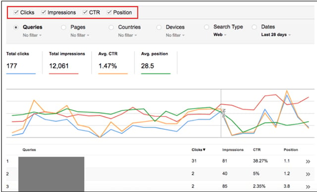
Doing this, you’ll be able to know what keywords of your website are performing desirably.
 
This practice is all about finding all the funnel drop-offs to maximize a website’s conversion rates.
Google Analytics Funnel Report can be used by any business sector to observe and track micro-conversions (leads that somehow closer to purchase).
Using the funnel visualization reports in Google Analytics, you can easily identify the leads who have submitted the contact form or visited certain pages to show interest.
Let’s take an example of an eCommerce website to explain the sales funnel. So, in a Funnel Report, the results will be seen in the form of –
Product Gallery — Product Page — Add to Cart — Proceed to Checkout — Shipping Information — Billing Information — Review — Confirmation Page.
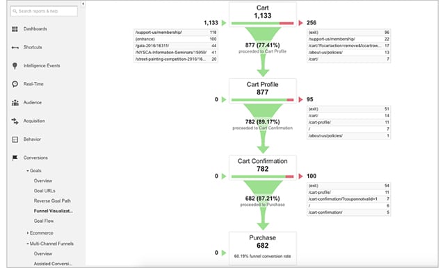
One of the most important and compelling reasons to track goal funnel is the ability to identify the problem pages during the purchase transaction. It describes the area where customers usually drop the activity or abandon the cart.
Track the aspect and optimize it as per customers’ expectations.
So far, you must have got a complete idea of what pages of your website need improvements for conversion rate optimization. You have all the reports and stats in hand but you still are clueless about what to optimize in these pages to attain maximized traffic and conversion.
So, here I’m mentioning a few techniques that will cover all the above-mentioned optimization factors and help you create a conversion based design.
It has been observed that a web page with a story is likely to convert 20 times more than a design with no story.
In order to create better products and websites, web and UX designers must understand what’s running in the users’ world and how their products their make their life easier.
Designing your website by including the product’s design to launch a journey not only makes visitors understand about the product/service but also makes them curious to know more about the same.
This strategy always works for an eCommerce shopping portal where a new product launch can be described using illustrations and particular graphic designs.
Let’s discover some amazing ways of how you can incorporate storytelling in your web design to attract more visitors.
Images: Popular brands always use images to portray their product story and customer satisfaction. You can take an example of any famous brand, you’ll find their pages integrated with captivating images designed to create convincing and pleasant stories.
Here, we have an image of Dove brand explaining everything in a single image.

Making your website meaningful and story-based can solve half of your problems of leads generation. It’s the best tactic for conversion rate optimization and can be better implemented by –
Illustrations: Just like images, illustrations possess the quality to portray the exact message to the visitors. An added advantage with illustrations is, you can describe the step-by-step process, conditions or relationships of any aspects.
This website design optimization practice works when you want to illustrate a process or work of any product to readers. These are very clear and arranged in such a manner so that visitors have no doubt in getting the described point.
Just like the below image –

The image clearly portrays how an illustration is made and can be used to create a successful design story.
Powerful Words: We know it’s a different approach away from the visual side. But, if you follow the approach of keeping powerful words in your web design, nothing can stop your design from getting successful.
Here, the motive is to include effective phrases and not lengthy descriptions as these would bore the audience after some time.
So, if you want to optimize your web design for better conversions, you need to put short yet compelling content wherever you find sufficient scope. It can be anywhere from menu bar, the content you offer or the words on call to actions.
Adding Personalities: Stories that are told in person leave a great impact on visitors. Adding pictures and videos of business personalities becoming an increasingly important aspect to create a modern web design.
Adding real pictures fascinate visitors and bring an interest that you’re yourself explaining your brand story and the future goals with the offered product.
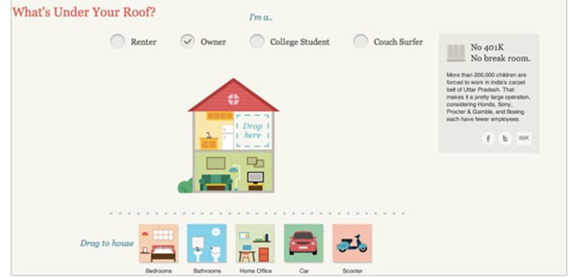
Interactivity: Besides images, illustrations, parallax scrolling and others, there are many other website design optimization techniques to engage visitors to the pages and that is by incorporating interactive elements. You can make it happen by making the visitors a part of your story.
For example, you want the visitors to complete a task to reach the desired page. In this case, create a story with images and micro-interactions by giving them an option to choose themselves as a story character.
See the below image for example:
Similarly, you can create a story as per your business conversion requirements.
Apart from the mentioned ones, you can also include Parallax Scrolling, Social Media and Video integration in your best design story practices for conversion rate optimization.
A website can’t be imagined without content. Even if it is not content-based, it still requires a few phrases or content to describe the motive of the page.
Content creation is crucial when it comes to gaining excellent results from a website. And it can only become possible if your content is effective, attractive and seems actionable to users.
Let me tell you how you can optimize your content so that you can get maximized leads and conversions.
These are the standard ways that help optimize the website content to achieve enhanced lead conversions.
On top of these strategies, I’m describing a few more proven techniques that as per me are effective in for content marketing and optimization. So, this can be done by –
Conversion rate optimization is tricky but beneficial if done correctly and effectively by utilizing the gathered website traffic data.
Most of the time, a website is optimized for repetitive points that other competitors are also using to attain great conversion results. You need to try something out of the league if you genuinely want your website to perform outstandingly across the web.
Here are a few most effective techniques you can implement to achieve great website optimization results.
Design every page for a specific purpose: Your page should be designed to accomplish a specific purpose. For example, if you want to target people to subscribe to your ebook, the page should be intended for subscribers only.
Keep your best content above the fold: Above the fold is the most captivating area of your website which you can embellish by adding clear and meaningful marketing content. And according to UX designers, this area is highly crucial to attaining conversions.
Integrate dynamic pop-ups: You must have seen instant pop-ups, asking for signup for a newsletter or any other email-related services, just when you access a web page for information. These pop-ups not only attract users but also compel them to fill the form to avail target service. Ultimately, it’s the best strategy for a website conversion rate optimization.
Make the form simple and short as possible: Users are in a hurry these days and want quick actions to be performed to complete any activity over the web. Being a website owner, it’s your duty to design your contact or inquiry form as simple and short as possible. It will help increase conversions by maximizing the user base for your website.
Make your page CTAs clear and meaningful: CTAs play a significant role in leading the users’ toward sales funnel. Therefore, these should be designed by keeping the page and target audience in mind.
The study says that there’s a direct relation between site speed and search engine rankings. So, if your website is fast to load, it’s ultimately optimized for ranking factors.
If you go through the article, you’ll know how important is it to make a website fast to load.
Basically, consumers demand fast website and so Google prefers it too. Therefore, speeding up the website is mandatory when you’re up for maximizing the conversion rates of your website. You can initially make it happen by –
There are different online page speed optimization tools that you can use to track and improve the site’s performance metrics. GTMetrix, Pingdom, Google Page Insights, WebPageTest, etc. are the most widely used tools for page speed optimization.
To gain users’ trust, you always need to play smart by understanding their specific needs and demands. You need to observe the way modern users approach a website. Unsurprisingly, mobile devices winning the battle as users are more likely to access information through mobile as compared to desktops.
But it doesn’t mean you’ll not design your website for desktop users. Because if you focus on mobile designing, you might lose desktop users.
To eliminate this hassle, build a responsive website along with the integration of mobile-friendly features. This way you will offer something that serves both mobile and desktop users uniformly and help improve your business conversion rates.
Website optimization for SEO is crucial and can’t be missed at any cost. This is the phase where you prepare your website for higher ranking on SERPs. Making your website design SEO-friendly is time taking but if you optimize the following aspects, you’ll be able to present your website for Google.
Meta Title: Optimizing meta title for length, major keyword and target purpose is the primary step when it comes to making a website SEO-friendly.
Meta Description: Visitors usually turn around to the link if they find the meta description effective and subject-oriented. Therefore, it should be optimized in such a manner that it summarizes the page’s content objective.
Header Tags: Defining target (or you can say, focus or main keyword) in the header tags is a sure shot technique to bring your page on the top of search results. So, always make sure that you keep your target keyword in the main page header.
Image Alt Tags: Image Tags are used to describe the image and its purpose for the page. It helps visitors get the image and take desired action based on their understanding. So, whenever you optimize the website for SEO, make sure you’ve placed relevant image text to all the images.
URL Optimization: URLs of the website should be created by using target keywords. The reason is, when users search for the keywords, Search Engine displays the matching URLs and connects them with the relevant content.
Canonical URLs: By defining canonical URLs to the main page of your product pages, you ultimately allow search engine to prevent your website from duplicate content issues. Therefore, if your website possesses different pages under the same page or category, make sure you specify your main page with a canonical tag.
Website Speed Optimization: Fast loading websites are the need of the hour as this brings visitors interest in the accessed link and compel them to stay for long over there. Increase your website’s loading time if you want to attract more visitors.
Mobile Optimized Website Design: Today, more than 50% of the searches are being initiated through mobile devices as users find it a suitable and easiest way to fast information access. Hence it’s proved that creating a mobile-friendly design can solve half of your problems of customer retention and lead generation.
Low Text to HTML Ratio: Basically, the text to HTML ratio represents the correlation percentage of the content to be actually displayed on a web page. It needs to be between 25% to 70% and if it is, your website is SEO-friendly.
Having an uncluttered website layout structure is a boon as it always drives optimum traffic and creates an urge in users to come back again. Ultimately, it helps businesses gaining quality leads and maximize conversions.
If you also want the same success in your case, start optimizing your website for page layout structure.
Let me tell you how…
Smooth Navigation: Smooth navigation is enough to impress a user by your website. It’s the initial point which decides whether you get a lead or fail in meeting the visitors’ expectations.
If you really seize the users on your website, make sure you create not only smooth but clean and uncluttered navigation. This includes easy flow, nicely integrated CTA buttons, well-managed menu bar, quick and relevant page direction and many more.
Clean Design: The next thing you can do to optimize your web design is to keep it clean and simple. Every web designer has different definitions of clean design but the most common facts they all have explained are –
Emotional Touch: It is observed that aesthetically pleasing and captivating experiences empower website usability and increases the user’s willingness to move ahead.
The trend also helps users learn and adapt things easily and fast. If you incorporate persuasive emotion features in your web design, this will definitely enable the particular emotion in users which enforces them to take swift decisions.
Elements you can add to create an emotional design –
Everything you do on your web page is always to maximize the quality of traffic and organic engagement. So, what do you think you’re doing to the percentage of your website engagement?
You must have placed a form with relevant fields to gather users’ data. It’s great and undoubtedly the best tactic to redirect maximum people towards promoted service exposure.
There are not so many definitions or ways when it comes to optimizing the landing page for better conversions. But still, there are some that are proven and work well for conversion rate optimization.
It’s sure that if you implement the below-mentioned facts you’ll be able to convert your lead generation form into a conversion optimization platform.
Let’s discover, what you need to do to attain the quality results:
Place the form above the fold
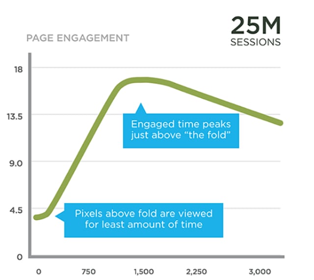
It’s a great idea to keep the lead generation form above the fold as the elements placed here instantly captivate users’ attention and compel them to click the CTA.
There are a lot of benefits of keeping the form above the fold as you can get an insight through the below graphical representation.
Reduce the number of fields in the form
Minimum form fields lead to maximum conversions. It’s not the theoretical fact rather, many case studies are there to prove this concept of how keeping minimal fields in a form is beneficial.
You can check the case study here to know how the website increased revenue to a great extent just by removing unnecessary fields from its checkout form.
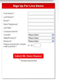
Also, make sure not to make every field mandatory by defining the asterisk sign. It frustrates users which ultimately enforce them to switch from the running task.
Include website’s privacy policy to wash off all the doubts
You design a form for prospects to lead them to complete the proposed action. It’s the common activity and of course the tactic that can bring maximum users to your site and convert them into leads. It’s very effective especially in the case of mobile-forms.
Here the question is how you will build that trust so that they don’t hesitate to fill the form.
Basically, you can do this by including the privacy policy at the end of your form page. If you consider users’ privacy as your priority, it will definitely affect their course of action and establish trust among them.

Form without privacy policy phrase integration.

Form with privacy policy phrase integration.
Here, you need to be careful by not making or placing such statements like “100% privacy – we will never spam you”. Instead, go genuine and relevant when it comes to targeting your users for the promoted service.
This is how you can optimize your form for better conversions.
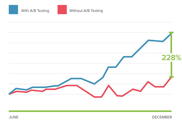
A/B testing is required to test both (mobile and web) versions of a web application on different parameters. It’s a process where two or more variants of a web page are randomly shown to users to make statistical analysis.
The technique is not even useful to check page performance but also beneficial to analyze which version should be used to attain conversion goals.
When you run the A/B test, it will ask you focused questions about the changes in your website. Later, the process iterates by collecting the data about the particular change.
Why You Should A/B Test Web Application?
Going through the below points will make you understand why A/B test is crucial to make a website conversion-optimized.
See the results of A/B test through the graph:
You might not have emphasized more on choosing web design frameworks at the time of your website development. But let me tell you one thing that it’s the most crucial aspect, making a website robust, powerful and user-friendly.
You may find a lot of web design frameworks but choosing the best ones from them is still a tough task. Fret not! Because, I’ve done the research work for you and listed top design frameworks, offering responsive, scalable, rich and interactive websites and applications.
Here are these –
AngularJS: AngularJS is considered the best framework to create awe-inspiring web applications. Launched by Google, this framework is designed with flexibility and a rich set of functions. This framework requires fewer efforts and provides fast and high-performance web apps in return.
Striking Features of AngularJS
AngularJS is widely known for its many other best features. So, if you’re up for building a single page dynamic web application, AngularJS should essentially be in your web designing and development toolkit.
ReactJS: ReactJS is an open-source JavaScript library that has been introduced and maintained by Facebook. Due to the best interface design features, it’s been largely supported and utilized by a big community of developers.
Earlier, the framework was widely used as a building tool for eCommerce websites but today, it has been accepted as great support for web application developers.
Striking Features of ReactJS
Using ReactJs as your web development framework helps you get an arresting website integrated with amazing user-friendly features.
Material UI: If you’re looking for a front-end framework that can easily adhere to Google’s material design guidelines, Material UI is the absolute option you can go with. You can use this framework to integrate material design features into your existing design.
Striking Features of Material UI
It’s good if your website is based on any of these frameworks as it’s already being designed by keeping users’ and industry’s perspective in mind. And if not, start planning to design it using the mentioned frameworks.
Understanding a variety of users (who visit web pages) and their intent significantly help improve the flow of a website. And fortunately, you’ve all the data that can help you understand the user intent and traffic patterns.
But make sure to be careful while using this information for website optimization it can lead to information analysis paralysis, as a result, nothing gets done.
That said, if you limit your search and utilize the above-mentioned website optimization techniques, you’ll set your business up for 2020 and beyond.
Thanks for reading this blog. Feel free to share your thoughts on this and if this was useful in the comments below.
If you found this information interesting, Subscribe to our blog to receive more solid helpful resources once a week in your inbox.
All the best!
The conversion rate is basically the overall percentage of users (out of total) who take the desired action on the website to buy something. You can also consider it the measurement tool to check your site’s performance from the users’ point of view.
A website conversion takes place when a user completes the action to a website and proceeds to purchase the service or item. Users most probably do it by signing up for a newsletter, filling out a query form, social media share and finally making a purchase. Here, the percentage calculation of total visitors that get converted (users who purchase something) is called a website’s conversion rate.
The average landing page or website conversion rate is considered 2.35%. But the theory transformed with the update that around the top 25% of websites are converting at the rate of 5.31% or more higher.
If we ignore the conversion rate update, it should still be at least 2% for every website or landing page. And if it’s not, your website needs conversion optimization.
Conversion rate optimization is a simple process to enable and compel visitors to take action when they go through your website. It ultimately your website user-base and of course the target audience that can be your leads or quality conversion in the future.
There can be various definitions of conversion rate in terms of SEO. But in simple words, it’s the result or report which depicts the exact sales or purchase done on a website.
In SEO, conversion rate optimization is all about finding ways that can help increase website quality traffic and leads. And fortunately, this can be easily done by using Heatmaps, landing page report analysis, Google analytics search query report evaluation and Google analytics funnel report scrutiny.
Everyone has their own ways to optimize a website for conversions. But there are a few most important steps that are commonly used by all of them to earn more from their website through increased conversions.
Best conversion rate optimization ways are as follows:
CTAs are essential to a website's success If you decide to recreate these CTAs on your site. Here are 7 great call-to-action examples to inspire you!
Getting an e-commerce website developed? Take your e-commerce website to a new level with these 12 must have pages on your ecommerce website.
Is your website engaging enough for visitors? Keep your page looking fresh by following these best website design practices for your website in 2022.
Be the first to know about new B2B SaaS Marketing insights to build or refine your marketing function with the tools and knowledge of today’s industry.