Best Practices for a Contact Us Page
Need inspiration for your business's contact page? Check out best contact us page examples, plus tips, tricks, and best practices for 2022.
To help you cope up and stay updated, we have curated a list of Top 12 design trends that you need to implement in your applications in 2020.
Estimated reading time: 19 minutes
Design Trends are the fastest changing factors in all of the development world.
To help you cope up and stay updated we have curated a list of Top 12 design trends that you need to implement in your applications in 2020.
The web design industry is constantly changing and heading towards attaining an exceptional edge over traditional methods. The facts are somehow true because web design has expanded to a level where it has become crucial to render highly-engaging and communication-oriented websites to the users to accomplish their needs.
It is said that designs speak louder than words and it’s now become possible with the advent of new web design trends.
Many of the passionate web designers utilize the latest web page design trends to bring life to all the design patterns. And it comes with no surprise that these modern website design trends play a significant role in business conversions.
So, without any delays, you have to find out what website design trends are a good fit for your type of business.
Every year, the industry bombards different types of trends on web designers and the confused passionates find themselves unable to single out the best ones from the long lists.
Here, it’s mandatory to answer the question:
What are the best website design trends that can actually work to make a website worth exploring for modern users in 2020?
To bring the best, I’ve curated the most sought after list of best website design trends 2020 that you can implement to create mind-blowing websites.
#1 Imperfect hand-drawn design elements to bring out emotions
#2 Stand out of the crowd with dark mode web design pattern
#3 Let your design interact with 3D immersive elements
#4 Make the most out of photography and graphics
#5 Use layers, shadows and floating elements to add charm in design
#6 Reap the advantage of solid frames with white space
#7 Adorn the website with luminous color schemes and bold typography
#8 Excellent space utilization with ultra-minimalist navigation design
#9 Create an intriguing website with split design and solid color blocks
#10 Design Full-screen Forms to Ease Information Gathering
#11 Create Unique Experience With Oversized Type and Elements
#12 Involve Parallax/Dynamic Scrolling to the list
Let’s not linger any more and delve right into the amazing web design trends 2020.
Before I explain the website design trends for 2020, let’s understand…
Integrating new things to web designs is the traditional approach to make a website engaging, interactive and more communicative for users. Web design trends, in the same manner, help web and UX designers to think beyond the limit and integrate state-of-the-art functionality to engage and attract users.
Design trends are the updated results of technological and cultural advancements. These are the web design practices every web designer follows to make the web design look more fresh and desirable for the target audience.
Additionally, these have been widely adopted by most of the web design and development companies to deliver quality-assured websites that stand out from the crowd. Doing this always provides a substantial competitive advantage which ultimately brings optimum profit and revenue for an associated business.
It’s the fact that website design trends come and go! This makes the scenario uncertain on what to use and what not. Here, the adroitness is in figuring out the best website design trends and implementing the ones that are winning the web with their groundbreaking design attributes.
Curious to know what are these amazing website trends?
Let’s have a glimpse –
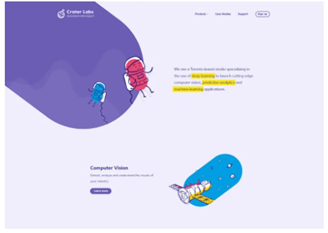
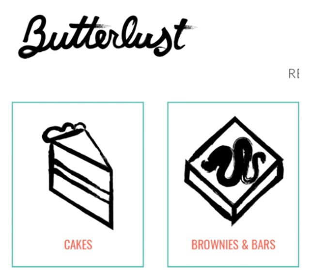
When you emotionally touch the users, they are more likely to engage with your brand. This trend is all about hand-drawn human design that might not seem perfect in design but can surely attract users’ attention in a single stroke.
You must be thinking that in the era of pixel-perfect design, how are users going to love imperfect hand-drawn designs? It’s the hidden quality of this rebellious web design trend, it not only attracts users due to unique sketchy icons but also makes the brand stand out of the crowd.
Hence, implementing this new web design trend will be beneficial, If you want the target audience to visit and stay at your website for more than a few seconds.
See the below image to have an idea of how you can integrate hand-drawn elements into your web design.
Dark design mode is the latest web design trend for 2020 that will last for long in the web design industry.
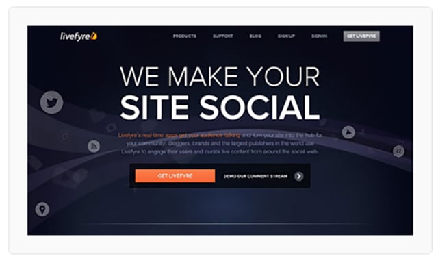
The biggest example of dark mode user experience is WhatsApp where users are given the option to enable dark mode or theme. Commonly, switching to the dark mode offers high visibility and contrast using soothing colors. This eventually provides optimum user experience even without much eye strain.
According to web design experts such as Ehten Marcotte, Chris Coyier, Karen McGrane and many more, integrating Dark theme is cent percent beneficial, attracts more traffic and converts them into quality leads.
So, if you plan to design a dark theme, you’re ultimately preparing your website to invite more visitors towards it.
This is how your web page looks like after implementing the dark theme feature to it.
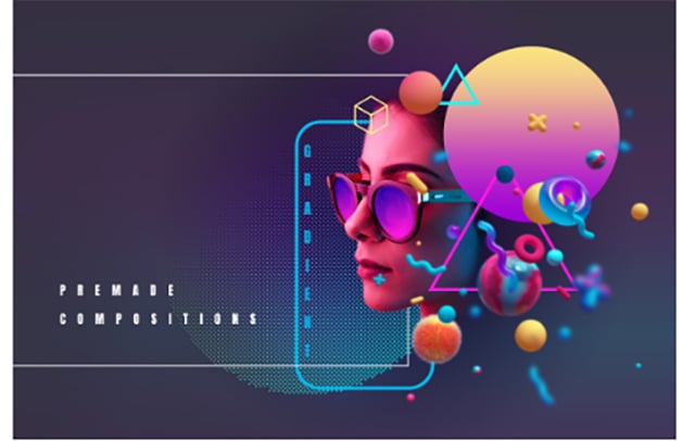
3D elements always delight people with their beautiful and more captivating appearance. This web design trend is not new but as it was a costly venture previously, so it was being ignored by web designers and website owners.
Today implementing this technology is so inexpensive. This helps web designers and web design companies embrace this hot web design to create masterpieces that are loved and admired by users.
Using real photography makes web design more attractive and realistic. More importantly, the design speaks louder and convey a more customized message when you add illustrations and graphics with your photography.
No matter your web design includes products, human images or something else, when you merge original photography with graphics, everything will work effectively to attract users’ attention. Above all, these types of images fully support branding and help websites stand out of the curve.
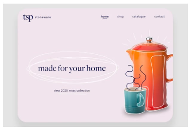
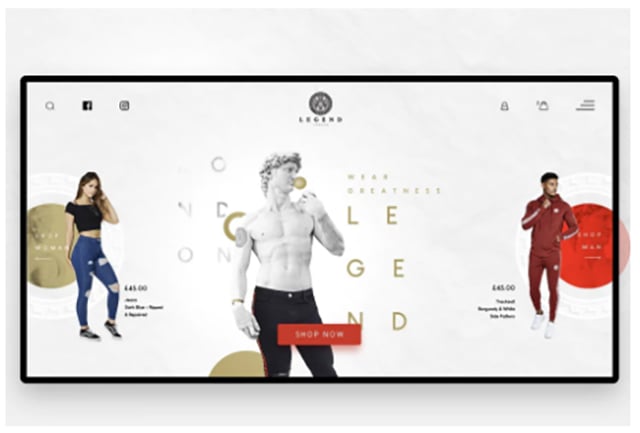
As per Alax Ivanov, a trusted 99designs partner – “Soft shadows and floating elements create a pseudo-3D effect and make the design more layered and more interesting.”
Interesting designs are the results of great efforts and especially innovations. Floating elements and shadows are examples of such innovation that make a design properly layered and more lively.
Though the elements are simply designed and integrated, these provide a 3D look and feel when observed by users. And the best thing you’ll surely love is you can integrate these designs with text and any photos too to create memorable experiences for users.
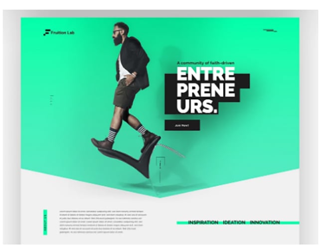
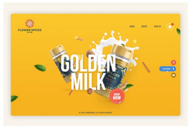
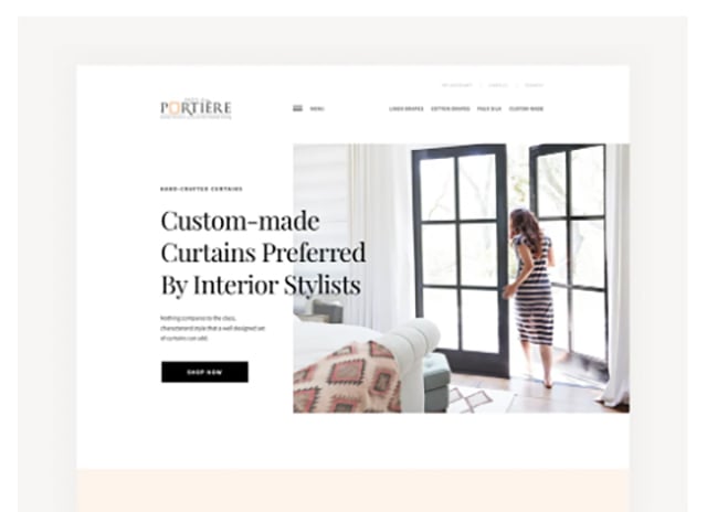
It is believed that keeping white space around the web page brings page elements out and provides website a position where it stands out among the competition.
This is all the web design trends all about. It’s gaining appreciation as it gives web layouts a solid white frame that gives the website a defined structure and stability.
In 2020, you’ll see more web designs with such solid white (any color frame) that web designers are planning to use for creating a perfect design foundation for better visual appearance.
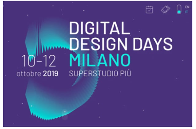
Earlier keeping the web designs simple and sober was the trend. But now the scenario has completely transformed as the websites designed using vibrant and hot colors like purples, blues and pink have become the source of attraction for users. Also, the audience loves the website which uses bold typography.
The trend got famous due to the audience love for hot colors and big text typography. As the trend has gone viral, there are chances that you’ll see more websites this year designed with courageous color pairings. And these will definitely steal users’ hearts through their daring colors and bold typography combinations.
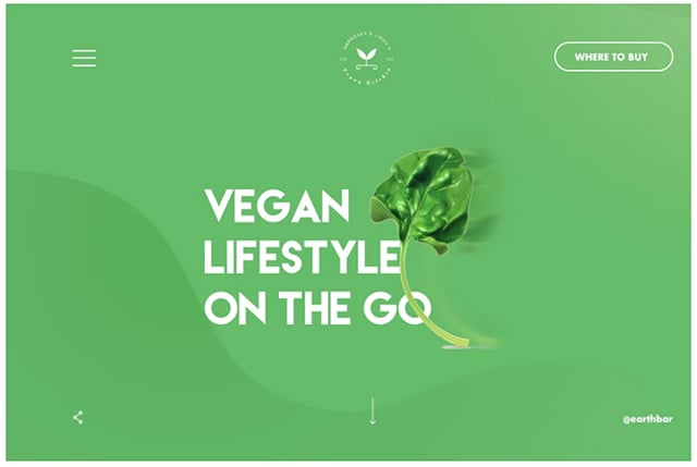
With the advent of wearable devices like smartwatches, web designers started thinking smaller. Here, thinking smaller is inclined to create minimalistic designs that accommodate everything in a smaller design.
The motive behind this web design is to facilitate smaller screen attractions. Using this trend will give you a clean minimalistic web layout where users’ don’t need to think too much to explore around.
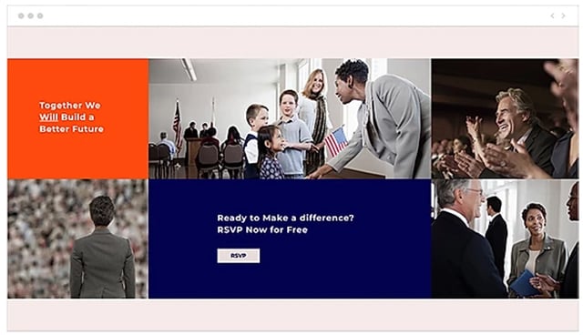
Websites having multiple contents and image blocks are designed using this trend. Basically, these are created by separating and splitting the design layout into multiple squares and rectangle blocks to make the page purpose clear.
Such designs can be created by placing separate messages and images in each box. Further, if you want to make the layout more intriguing make sure you use different colors and shades for each individual block box.
This design is gaining prominence and will also be appreciated in 2020 and beyond.
Example: Split Design
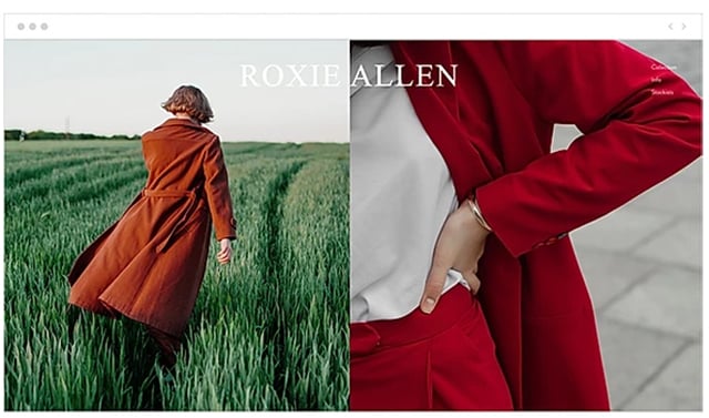
Example: Color Block Design
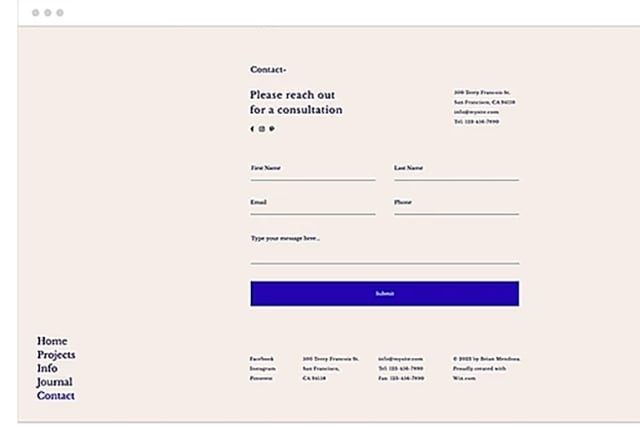
Online forms play a significant role in initiating and completing many of the website interactions. Right from generating a query for a product, signing up for a service to filling delivery details for a product, everything goes through a website form.
A form is responsible for so many activities to be done. Don’t you think this should be designed with more focus on expanding its size?
Sometimes, users consider filling the form a tedious task and especially when the form is too short in size as it doesn’t even let users see the details clearly. Due to this, users don’t bother to proceed further and abandon the page.
To increase users’ interest in filling the form, designing the form with an expansion option will be more effective. It allows users to expand the form if they’re unable to see the particulars in the form they need to fill for some inquiry.
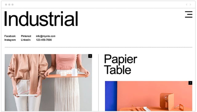
Favoring large elements has become an amazing trend these days. According to professional web designers, putting large elements helps communicate clearly and instantaneously with the readers.
The best part is, you’re not limited to putting a few elements here. This design pattern allows text, images, GIFs and even videos to be put in a big or oversized format.
These are the top website trends that are probably going to rock the web world in 2020.
But you’ve to be careful while putting the oversized elements on the page as so many elements together can be overwhelming. And if you succeed to integrate the text and image elements appropriately, you’re almost on a successful path.
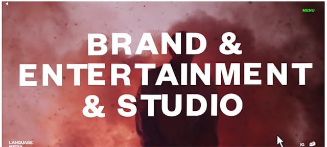
A few years back, creating long pages was out of the trend as it is believed that the ages should be designed minimally by keeping the most important information above the fold.
But now, with the advent of dynamic scrolling, it’s become possible to see long pages with long scrolls.
This web design practice suggests designing a page in a way that makes it obvious for users that there’s a more for them to view below the edge of the screen.
You can create such types of pages if you want to convey users a complete message or process through a single page.
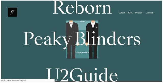
Visit Site for reference – https://www.femmefatale.paris/en/project/tati-express
The above-described trends are new to the market and claim to provide optimum benefits to small and medium web design agencies. But it doesn’t mean that the existing and old web design trends will not work in this new year.
There are still some best website design trends that can never get old and also aren’t going to leave their charm in current and upcoming years.
Discover what are these trends that stay in the market even after rigorous competition.
Today, web designs need to be designed in such a manner that visitors can easily understand the brand’s story. It helps a lot in brand building as when a user gets interacted with a brand’s story, their urge for exploring increases which eventually turns into product purchase.
It’s not Rocket Science to design your website integrating the storytelling concept. To get this done, you only need to put your business goals and mindset in a crisp manner to the best-suited templates.
To conclude, storytelling in web design is beneficial as it can lead your brand towards success. This is the most promising 2020 web design trend and expected to be in the industry for many more years.
Undoubtedly, video integration gained immense popularity in 2017 as the best website design trend. But later on, due to the slow page loading issue, the trend faded away and replaced with short moving animations and graphics.
Graphics and animations have become pretty popular with readers as these don’t take much time to load and make the message clear for users.
And not only animations and moving graphics add value to web design but also there are GIFs and custom illustrations that are equally important in offering exceptional user experience to the visitors.
It is said that an image says thousands of words when designed or optimized appropriately.
Now the quest is what type of images are in trend and making the most out of web design.
The right answer to this is Hero images. These are the larger images that are placed on a home web page, grabbing users’ attention just when they come to the site.
Placing such an image lets a web page displayed like a banner where it smoothly conveys a lot of stuff in a single scroll. Above all, Hero images are designed to provide a quick crux about the website that users love and admire.
Micro-interactions are crisp and short UI animations that have become the best 2020 trend in web design. Being new to the web design world, these tiny elements drastically winning the users’ hearts with sweet gestures.
These elements are designed creatively to add a human-like feeling to the website that not only attracts users but also pleases them with their first sight.
Most of the modern websites are integrated with different types of micro-interactions that you might not have noticed yet.
Let me explain how you can recognize if it’s a micro-interaction or not.
Using these micro-interactions in a web design encourage users for interaction and to interact with the website and web application.
So, it’s a win-win situation if you go for these aforementioned 2020 web design trends.
But wait! As you’ve unlocked all the best and top web design trends 2020, it doesn’t mean you’ve become the master of web designing domain. To become a pioneer in web design, you need to have a complete command on the best web design practices.
Let me help you by explaining them in detail:
There are a few best and most important practices that can help web designers accomplish all the design-related activities with ease and finesse.
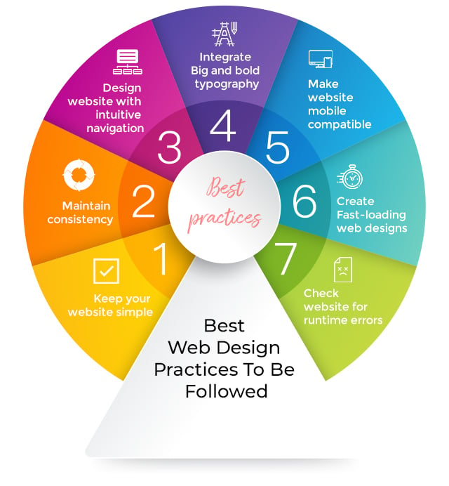
Simplicity always works as the best design practice. Keeping so many elements in a web page or making it complicated may lead users to distract from the main purpose of design.
Therefore, it’s better to keep the website simple as it not only makes it fresh and appealing but also helps users to seamlessly navigate through the website.
Consistency in a website design matters a lot as it portrays the brand’s standards. To keep the design consistent, it is suggested to match all the elements in all the web pages. For example, you have to keep all the fonts, headings, subheadings, button styles and colors the same in all the pages.
The best practice to get this done is to plan everything in advance.
Cluttered or confusing navigation also frustrates users and gives them a reason to instantly leave the website. Make sure all the sections and drop-down menus are designed synchronously in your web design so that users can browse the category without facing any troubles.
Basically, it’s a design practice that has become the web design trend these days, making the most out of its attributes. The motive behind this strategy is to make the message clearly visible to the users in a glimpse.
To make your website working, you can use the fonts that are easier to read and combine them with proper typefaces.
Mobile-compatibility is the most prior aspect that needs to be integrated with every web design. It’s important because everyone is mobile-obsessed and tries to get everything done through their handy mobile devices.
In this case, if they don’t find anything compatible with their smartphones, they’ll skip it and switch to another one to accomplish their needs. Here, making a website design mobile-friendly is the best solution to efficiently serve all types of mobile users.
In this fast-paced era, dealing with a slow loading website is a complete waste of time. Users love to explore websites that are smooth and fast to load.
Therefore, it is recommended to make the website fast so that users can consider it a beneficial source to gather relevant information. If you want to do it, you only need to optimize a few aspects like images, videos, animations and content on your website.
The most crucial stage for a website is runtime error testing because it’s the phase that decides whether your website is ready to launch for users or not. This might include navigation, readability, device and browser compatibility issues.
So, to avoid bad user experiences, it’s mandatory to free your website from all these issues. This makes users contended and encouraged to explore further.
Up to now, you got to know the approach you’ll follow to design a website by using top web design trends 2020. It’s time to make you aware of the best web designing tools that are widely used to render great results.
Most of you must be aware of it but still, I’m taking this small initiative to make this concept more clear among novice web designers.
Here I’m mentioning top tools that have been broadly used by web designers for years for designing, impressive, engaging and user-friendly websites.
Free Photo Overlay and many more.
These are the well-known web designing tools that are widely appreciated by the designers and helpful for creating low-budget web designs.
You can explore each one of them to know more about their designing features and attributes. Or you can take the assistance of an experienced web designer to make you understand the tools with practical examples.
You’ve all the best web design trends in hand that claim to offer not only modern but highly-engaging web design results. All the described trends are most-sought after and accumulated after in-depth research.
Hence considering these web design trends are beneficial if you’re planning to design a website from scratch or wish to optimize the existing design with some classy layout features.
I hope you like the ideas I’ve shared through this blog. Share your views via comments and click on subscribe if you want well-curated trending information directly into your inbox.
All the best!
The aspects that help a website make beautiful, engaging, communicative and most importantly user-friendly are known as web design trends. These can be anything from navigation, design, color schemes, typography, to website frames design.
Web design trends that are currently booming across the web industry are hand-drawn design elements, dark mode web design pattern, 3D immersive elements, photography and graphics, layers, shadows and floating elements, solid frames with white space, luminous color schemes and bold typography, ultra-minimalist navigation design, split design and solid color blocks, full-screen forms, oversized type and elements and parallax/dynamic Scrolling.
There is a contribution of various factors when it comes to creating a good website design. Among them, functional layout modern design, easy navigation, responsive and SEO optimization are the best considered by web designers.
Using the below elements in a website results in great traffic and excellent user engagement. These are -
Building a website is not as easy as you need to think from users’ perspectives. For that, you will require to have a solid web design strategy that should contain -
Need inspiration for your business's contact page? Check out best contact us page examples, plus tips, tricks, and best practices for 2022.
A well-trained designer can tell within moments of viewing a design whether its creator knows how to work with typography.
If you're working on a design for your website, make sure you follow or consider these vital principles of web design to secure the first impressions.
Be the first to know about new B2B SaaS Marketing insights to build or refine your marketing function with the tools and knowledge of today’s industry.