Top 12 Web Design Trends You Must Follow in 2020
To help you cope up and stay updated, we have curated a list of Top 12 design trends that you need to implement in your applications in 2020.
What are the web design trends in 2017? let's explore 5 design trends to invest in 2017 to give your website a serious facelift.
Estimated reading time: 0 minutes
Adaptability is a design euphoria in the industry. People talk about it all the time and make this as one of the top features they need. But, how many of you really know the trends that top the design blog conversations? Not many! No problem.
Adaptability is a design euphoria in the industry. People talk about it all the time and make this as one of the top features they need.
But, how many of you really know the trends that top the design blog conversations?
Not many! No problem.
This article will help you identify the top 5 web design trends you need to follow to keep your designs and user experience top notch!
Design Fluidity is a key feature in any good layout. To improve UX, the design should be simple responsive and user-friendly. We all know this….. but how does it all work.
Keep reading….
Responsiveness has become an integral part of the designing since 2010.
Responsive design in web design is a smooth transition of a web layout to any screen on desktop or mobile platform.
Responsive layouts minimize hassles like zooming, panning or scrolling to make the website readable with its functionality undeterred.
Its core feature is to enhance the user experience to reach do the set task assigned by the application.
Companies like us, give most priority to user experience, seamless user flow and ease of finding information or next step.
Our design process features setups to encourage client involvement and designer skills to build unmatched application experiences.
Okay…. Let’s come back to the main point!
There are many design trends that have been trending in 2017. Here are a few that you can use in your business.
#1 Hero the Images
Images as all of us know are one of the most important aspects of a web design so hero’ing the right image size with the perfect content can make or break a conversion cycle.
Larger images on your landing page that look like a banner can convey many things in a single scroll. So, pay good attention to it.
It gives the users a crux on what the website contains with the help of a large banner like the high-quality image.
Visuals appeal to the customer than a lot of lines of content. The hero images convey the website’s aim visually and interestingly.
Note that the image needs to be optimized.
Large images take the time to load. This can greatly affect your bounce rate. Increased bounce rate means low website traffic, low leads and hence low conversions.
With the increase in internet speeds along with the advancements in technology, it is now possible for the websites to use large images as part of marketing to attract customers.
Check some of the amazing hero image examples that you can take inspiration from.
“Visit website: https://www.masterclass.com/ “

Hero Image – Materclass
“Visit website https://www.invisionapp.com/”
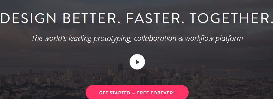
Hero Image – Invision
“Visit website https://www.bigcommerce.com/”
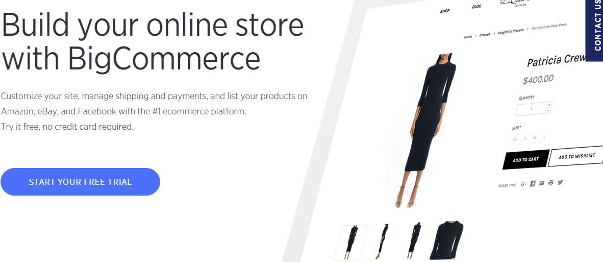
Hero Image – BigCommerce
#2 Material Designing
The Material design was first developed for Android apps by Google in 2014.But slowly it started spreading to the web design world and is being trended ever since.
This form of designing is a much cleaner design concept, providing a consistent and smooth look to web pages.
Learn More! Amazing User Experience & Stragegy Design
It also helps web pages have a unified experience across platforms and device sizes.
You can consider it as a step ahead of flat design.
To understand more, here are their three principles on which this framework is based.
• Material is the metaphor
• bold, graphic, intentional
• Motion provides meaning
The material design uses shadow effects, movement, and depth to create modern, clean, and more realistic designs.
This is a feature which you should definitely consider if you are just in the process of designing your apps.
#3 Mobile-first designing
Yes, we all know this!
But to prove it, I have some stats to show.
The following chart is a snapshot of worldwide internet usage through October of this year and the result truly speaks volumes.
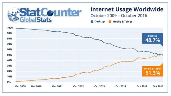
Courtesy: http://bgr.com/2016/11/02/internet-usage-desktop-vs-mobile/
“According to similar web, mobile now drives 56% of all traffic.”
Smartphones are trending in the market and we all know that the numbers are going to rise with time.
The advanced operating systems of the smartphones and the built-in technology make it easy for anyone to use their phone for almost everything.
This is no surprise that many users have been using smartphones for e-commerce and even bank payments.
Learn More about Best Practices For a Contact Us Page
“According to a recent stats, Mobile digital media time in the US is now significantly higher at 51% compared to desktop (42%) “
Which means that users use mobiles more to access web pages than desktops.
The change of such trends has actually been a big reason to change the old responsive design trends.
By creating landing pages which are more focused on mobile screen i.e. the pages that have minimal content (but amazing one), light images or NO images, to the point and clear call to actions/next steps can be a big difference in making your marketing efforts show better results.
Slight updates and changes to your landing pages can also be a huge reason to improve conversions.
NMG has stepped forward to take up mobile first designing into its process and understand its significance for the near future.
#4 Storytelling
Who doesn’t like stories?
Stories are capable of capturing any one’s attention unmindful of their age group. The same concept has been absorbed by web designs too.
Storytelling is a cool approach to web design that can, when done right, compel users to convert more effectively than what any amount of optimization, crazy visual callouts, or awesome interactive elements can do otherwise.
Storytelling contains a crisp or a small story with a self-descriptive visual that caters to your persona and branding. Planning a story with design comes down to understanding your customer and their behavior.
Every business has a creative story which can be built around their users and their problems and what solutions your company provides.
The more clearly this aspect is understood, the better you have a chance to increase your outreach.
Explore Web Design Best Practices – 10 Stunning Examples
Our experts can help you build the right customer persona, build a keyword list and suggest content ideas that can be used in your marketing campaigns,
It’s your job to make that story clear and engaging for users thereby reducing the bounce rate.
Let me show you how you can do this.
A good story has three points to be kept in mind. They are
• Target audience/customer persona
• Business Objective
• Your unique selling points
First, let’s start by creating your customer persona.
Some questions you should ask yourself.I recommend you share these questions with the senior team members of your company and the management and then compile everything to create the perfect user.
1. What is their demographic information? You need to look into your client base to find this information.
2. What is their job and level of seniority?
3. What does a day in their life
4. What are their pain points? What do you help them solve?
5. What do they value most? What are their goals?
The above answers will create your ideal customer persona.
You could have multiple personas, but even then, you need to figure out your primary user type for whom you will create the maximum marketing campaigns and content.
Next, is finding your business objective.
This objective I am talking about is the objective for your application or landing page.
Whether, if you need to make ease your sales process, or you need a lead generation channel, or you need to increase brand awareness, increase traffic or just revenue.
This objective needs to be clearly defined.
Next, we talk about the main selling points.
This is where the value lies. This is where your product or service is helping your users solve a problem they are facing.
Combining all the above will automatically let you create your story.
You can always refer great design templates to take inspiration from to create your story in the right flow.
#5 Interactive Card based Designing
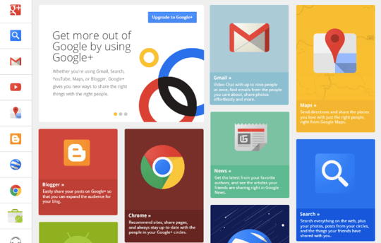
Courtesy- TrackDuck Blog
The above image is exactly what I am talking about.
Cards are another fast pacing design pattern loved by the users.
It has been trending the web as the best design pattern for mobile devices as its content is organized, easy to find and read.
Contents are broken down into individual components and assembled again in the form of cards.
With Google Now, Google is revamping information distribution, away from search, to personalized information pushed to mobile devices. Their design pattern for this is cards.
The famous website Pinterest is the best example of the websites that use card layout.
When it comes to responsiveness, cards offer excellent compatibility with responsive frameworks because designers can add and collapse columns of cards to adjust according to the size of the screen.
Designers design cards with a fixed width and allow card height to remain variable thereby achieving responsiveness.
Cards can organize a large amount of content and display it in an organized, effective and attractive way.
The effectiveness of the card layout will really leave you awestruck by the way a lot of information is displayed in a clean and organized manner.
Including rich animations and videos are also tending to enhance the UX and engaging users in the site.
These animations make above storytelling point more effective and interesting.
There are a lot of animations that have been trending this season, some of them are:
Hover animation: The animations that work on mouse hover. You would have seen these animations in popular e-commerce sites to give a 360-degree view of their products.
Motion animation: These are the animations that do not require mouse hover to play. They keep playing repeatedly. These are perfect to draw user attention and help a lot in user engagement on the site.
Background animation: These are simple animations that play in the background of the website. This contributes to the appeal of the website.
There are large and small-scale animations available too.
Large-scale animations are primarily used as an interactive tool which fascinates users with effects like parallax scrolling and pop-up notifications.
Small-scale animations don’t involve user input unlike the large-scale animations but will have functions like spinners, hover tools and loading bars.
Animations increase the user interest and in the meantime, it conveys the site’s relevant information to them.
Learn about 5 Mistakes You Can Avoid When Collecting Design Feedback
It is no wonder that it is trending among the users.
Wrapping up
Responsive design has become inevitable for companies that focus on User Experience.
With the advancement in trends, there are more and more great features that help you improve your website’s UX.
Even though the trends are described generally, it is your call to understand the requirements of target users and implement the relevant functionality according to the trend.
Only if you come up with the trend, you can gain more popularity.
Like they say – “When in Rome, do as the Romans do”, the more we scale ourselves with the trend, the more audience the website will receive.
I would love to hear your response to this article. Please feel free to ask any questions or share your comments below.
If you also would like to learn more about our design services, you can drop us an enquiry here and we will contact you as soon as we can and schedule a free session with you to review your current design state.
To help you cope up and stay updated, we have curated a list of Top 12 design trends that you need to implement in your applications in 2020.
Designing a great website user experience requires understanding the problems. Go through SEMPO Hangouts Session to know about the UX Design best...
Ready to make sure your Web design is looking its best? Read on to know about the best Practices for web designing.
Be the first to know about new B2B SaaS Marketing insights to build or refine your marketing function with the tools and knowledge of today’s industry.