What do you think is the most viewed page of a website? A Home page? Blog page? Or A product page?
What do you think is the most viewed page of a website?
A Home page?
Blog page?
Or A product page?
You’ve got it all wrong, the most visited page of any website is it contacts us page.
There could be many reasons behind this, it could be laziness, or they’re just busy but people often visit the contact us page and expect the owners of that website to get it touch when they can.
So creating a great contact us page to give the best user experience to your potential clients is the goal.
Let me show you the factors which the best contact us page should be having
- Make sure your problem-solving factors are visible
- Phone numbers and email address should be clearly visible
- Include a small application, wherein they need to understand who is contacting them
- Call to action is really important, just in case of they do not wish to fill the whole form
- Showcase your portfolio and blog links, to keep them informed of how capable you are
- Links to your social media accounts is a must
- Reply or redirect them with a thank you note and inform them when and how you will be contacting them.
All right! Now that you know what you need to have in your contact us page, I would like to show you some of the best examples of “Contact Us” pages. Take a look at them and think about how you can incorporate some of the ideas
Learn More about Website Design Trends To Invest
Coca-Cola
We all know how big coca cola is in terms of business and size of the company, they could ignore their contact-us page but they do something ingenious with their contact us page – they’ve put a virtual agent clearly visible to assist you forehand.
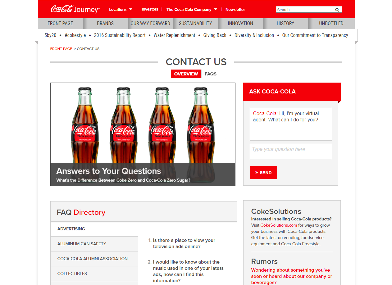
In the new era, nobody really has patience, a virtual agent with a prompt response is an easy way to get help for anybody.
Right below is the main picture is an FAQ and other means of contact, giving users their contact method of choice.
Atlas 1031 exchange
The page design might not look appealing but the functionality of the website is just amazing, here take a close look at it
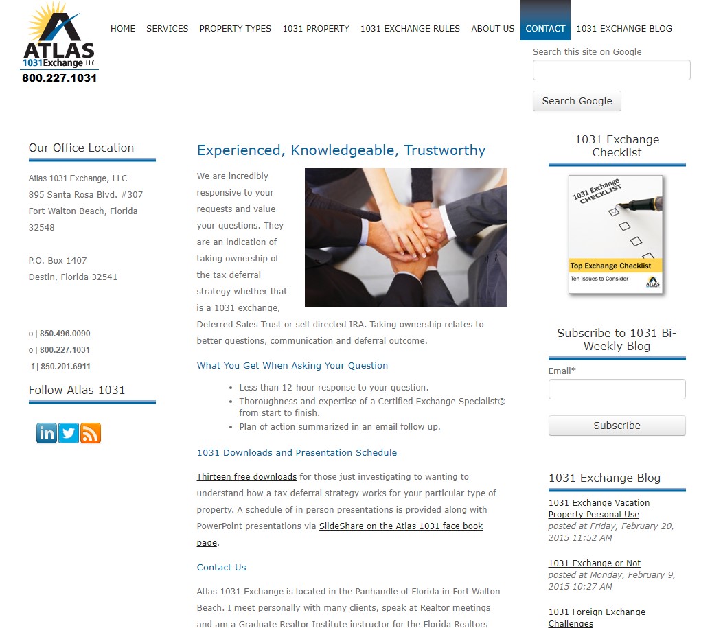
The page explains thoroughly how responsive they are to questions, all the contact information i.e. the email address and phone numbers are to the left, subscription to their newsletters to the right, right below are the links to their latest blogs, all the information you need from this website at just a glance.
Grover Web Design
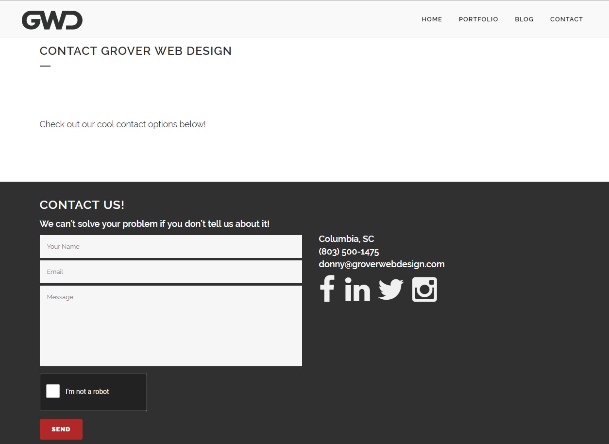
One of the best-designed contact pages I’ve ever seen, it is the best of web designing, as the company itself is into web design there is no surprise to see their work on their own contact us page.
A column to fill out your details, so that they could contact you back and a column of social media links to their other modes of contact.
Simple and elegant.
QuickSprout
This is one of the most interactive websites I’ve ever visited, one of its kind.
It features scrolling infographics, explaining how many emails Neil Patel get each day, and how little time he has to read them all!
You’ll only reach Neil’s contact form after scrolling through these infographics. You need to take a look at this yourself.
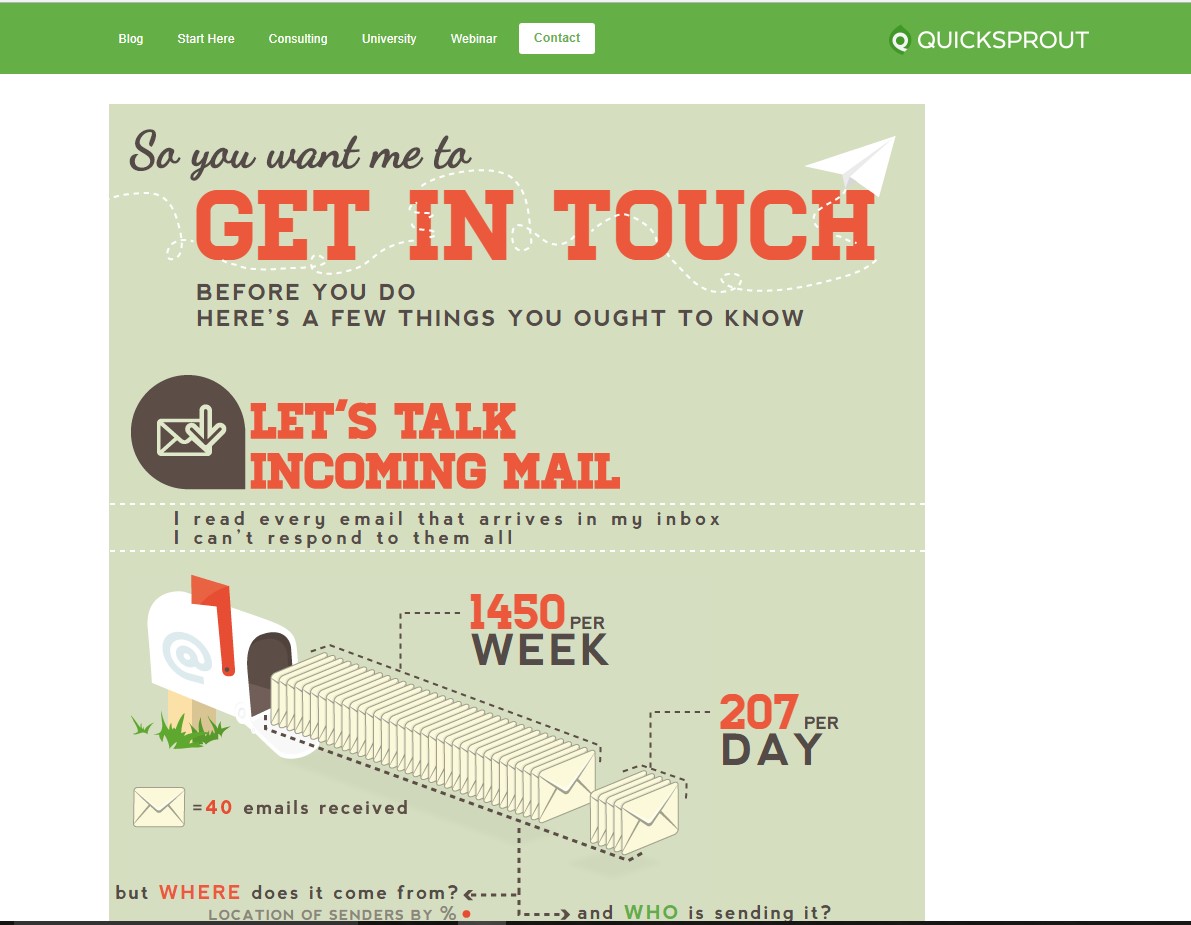
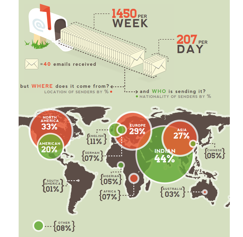
Okay just go to the link [QuickSprout] to go through the whole scroll.
NMG Technologies
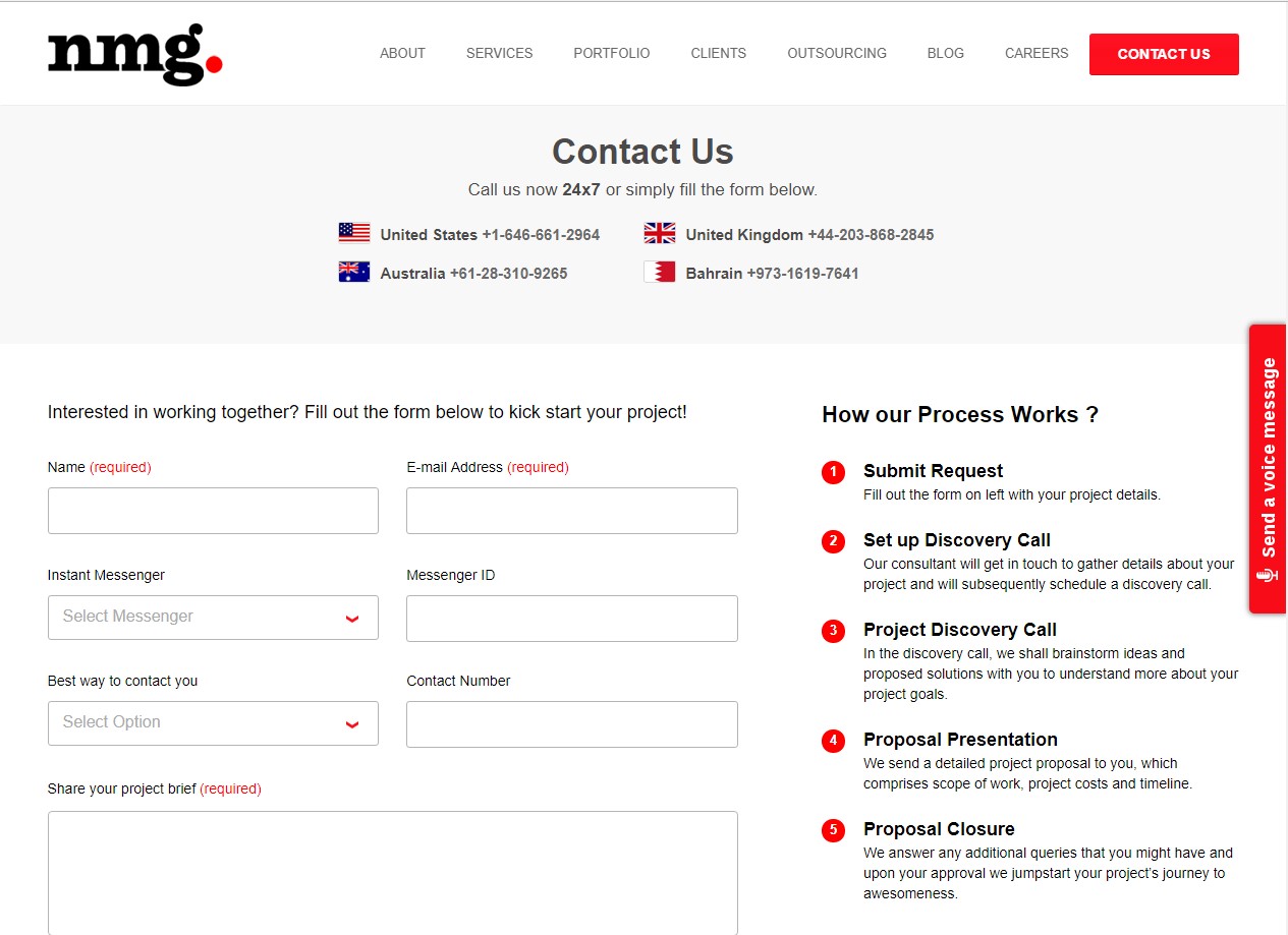
The page design is a perfect example of web design and development, with all the information at the right place, starting with telephone numbers of all the branches they have around the world, then the personal information form under it.
To the right is the FAQ’s, the forehand information about any question you might have regarding your project.
And I see something new here.
A Voice message?
Looks cool, try it for yourself. Maybe it is something you might want to adapt for your website.
I’m pretty sure you have picked up some knowledge from the examples, Let’s take a quick look at some of the best practices you need to follow while creating your own Contact Us page.
Learn More! Amazing User Experience & Stragegy Design
Use a common language
The name of the contact pages differs according to different businesses and professions.
If you’re are into IT services stick to contact us, but if you’re into something creative and something out of the box you’ve got all the flexibility to give a different name.
But keep in mind a visitor should understand the same. Here are some of the other names of contacting us already in use
“Support”
Basecamp
HubSpot
Zapier
“Help”
WordPress
Help Scout
Some of them have “Help&Support” but you can choose your own depending upon what you think would suit your website or business.
Keep in mind. Keep the “Contact Us” button where it usually is, if you are experimenting make sure it is clearly visible.
Do not make people hunt for the Contact us button.
Humanize Your Support Team
It may be a customer or a potential client looking for help or business with you, keeping only a text format is not really helpful, people would want to talk to a real person. Personally, I would want that too.
Even if you are a start-up please leave a phone number which will be answered.
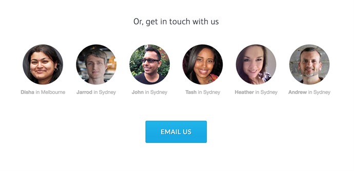
And most importantly put a picture of a person, if you have a support team. Studies suggest that our brain is finely tuned to recognize faces.
And faces of your own team rather than models would be a great addition and charm to your contact us page
Follow standard Design patterns
Sometimes it’s okay to be a stereotype, although your website may not look unique it will surely help the people visiting it, never give a hard time to the people who are already frustrated.
Especially if you are into services, stick to the rule book.There are many frustrated and angry customers out there.
Use Design patterns to guide people
Coordinate with your web designer and create a unique design to help guide people without even searching for what they want, the best support option for each customer depends on who they are, what their question is, and what resources the company has available to help them.
For example, a customer who needs to reset their password is better served by a simple help document rather than waiting for your email reply.
Add structure to your FAQ’s
Adding FAQ’s doesn’t just end your job, you need to answer all the possible questions you would expect from a customer.
If you are an IT service provider, you should know what questions you would be asked, when a potential client wants to know more about you. Refer the pattern from other service providers.
The FAQ structure should always be relevant and the order of questions should always match the thinking of a typical client.
If there is a question asked in your emails frequently other than your already listed FAQ’s, please add it.
The right amount of structure on your Contact Us page can save a lot of time and hassle for you & also your potential client or customer.
Be quick with response time
The sooner you respond, more chances of growing your business. As far as I’ve seen a prompt response is somewhere between 3-4 hours, even if you respond earlier than that, make sure you send an automated response when you receive an email. This will ensure the customer that their email has been received and they know in what time period they would receive a response. It should look something like this
It should look something like this
“Thank you for reaching out! We’ve received your message. Our team will look into it and our representative will contact you. Looking forward to
Looking forward to answering all the questions you might have for us! We will get back to you within 24 hours.
Can’t wait that long? Reach out to us for a live chat www.**********.com or call us +00 0000000.
Thank you for choosing us!
“ Your response time may be quicker, but as you see in the example we have mentioned 24hours, play safe!
Don’t forget to make space for some feedback
One of the best practices for a contact page is requesting for a feedback, how else can you know the user experience or what they actually want!
Throw in some questions which would help you grow and also helps your future customers. This will only make you better.
I’m sure by now you’ve realized the importance of a Contact Us page.
Do comment below if you have any suggestions which I might’ve missed.
If you are looking forward to enhancing or create a new Contact Us page or a whole new website, I know someone who is really good at this. NMG Technologies have some of the best Web Designers who could help you build your dream website or just a Contact Us page. Give it a try!
Learn More about Web Design & Development