Have you ever heard of these phrases “First impression is the last impression” or “You never get a second chance to make a first impression”? It’s the same case with your Website’s design when a potential client visits you, the thing which makes them engaged to your website is the Design.
Have you ever heard of these phrases “First impression is the last impression” or “You never get a second chance to make a first impression”?
It’s the same case with your Website’s design when a potential client visits you, the thing which makes them engaged to your website is the Design.
Web Design and development has two main factors UI design and UX design, which have their own importance in giving a user the best experience.
Ok I’m not going to discuss a lot on Web designing and development but I’m only going to give you a brief idea of what these terms are and how helpful they are in designing your website.
UI design is the user interface where the human-computer interaction is taken care, and UX design is done by the UX designer, where the user experience while using the website is taken care.
The best use of these two factors UI/UX design is what makes an amazing website, the involvement of the User experience designer will help you in the growth of your business or the purpose of having your website. Follow these best practice website design to give an amazing user experience.
Since you’ve understood the importance of the Design, let’s talk about why do you actually need a website and what can a website do for you.
If you’re not living in a Cave, you know what a website is so I’m going to skip that part. A website your online spokesperson who represents you and what you’re projecting yourself to the world.
It’s not really important about what you are projecting because it’s your decision, but it is important how you’re projecting it. This is where web designing will be a handful.
A website can simply be a marketing strategy of your business or motive, so I’m listing out 10 reasons why websites are an important tool for marketing
A couple of decades back print advertising was one of the most effective strategies for marketing, I’m speaking in global terms.
Ever since the internet is accessible to everyone especially after the smartphone revolution the importance of a website for marketing has immensely increased. It’s a one-time investment, you can make changes as many times as you can and it doesn’t cost as much as Printing. So a website is a must.
The internet marketplace is vast and has no boundaries, you can reach out to anyone, anywhere at any time with all the content you’ve updated on your website, the content is accessible to anyone who is interested, and also with better marketing strategies you can expand your business immensely.
Diversifying the revenue streams is one of the reasons, a website is not just a medium for representing a company, but it is also a form of media from which everybody can acquire information.
As mentioned above you can be available all the time, you won’t be turning away any customers. Your website will address all their answers and if they are really interested, they can leave their information and you can always get back to them.
A website offers more convenience for both you and your customer, your customer doesn’t have the need to walk up to your store, he can access everything and make up his decision on his couch.
If you can learn more from other websites and standardize your marketing strategies, there is no limit to your growth.
A website gives you the credibility to tell your potential customer why should they choose you, and you don’t have to sweat out giving presentations.
You’re providing the benefit of not getting lost to find you, to your potential customer. How’s that? By being online in the form of a website you’re just a click away!
A website serves as a great place to refer potential investors, to show them what your company is about, what it has achieved and what can you do in the near future.
Ok so since you know what a website can do for you, lets come back to the design part which is the main subject for today, got a bit carried away back there!
How do you begin the design part? What are the elements which need to be followed for your portal web design?
What are the elements which need to be followed for your portal web design?
When you are planning the design always remember this “You only have to implement what is essential”, so what are the essential things which contribute to the design and elements followed by major web design companies.
Let’s find out
Add Stunning Visuals
Adding stunning visuals is one of the most powerful tools of designing, it’s one of the reasons to fall in love with a website and make your customers want to visit again and again.
Stunning visuals need to follow certain elements to be stunning, elements like Vivid photography, bold contrast, and eye soothing visuals.
Wait I think I’ve got an example which you could follow.
exposure.co sets a good practice website design example with its good use of white spacing and amazing photography. Well, it’s not just photography, but it also adds up to what they want to convey.
Adding Vivid Photography
It may not be everyone’s taste but you can always try this, it ads that punch which sparks your customer’s eye at a glance.
If you want to make a use of this comfortably without dominating the foreground, you can use oversized and vivid photos, both for the homepage and the inside pages.
When selecting the photos, you should choose high-resolution pictures that have ample negative space, this will help in high-quality web design.
This kind of a design can be used for creative businesses if you would want to try out on your corporate website using it on a homepage is fine, and anything other than that is not suggested.
Play with Contrast
Contrast is something which gives a great feeling of being on the website, even if it may not be the user’s favorite colors on display. A right combination of colors and the right amount of contrast is always a great look for your website.
Simple Navigation
Never ever confuse your customer, keep the options simple and try to standardize them, adding a bit of animation is always a good thing. But don’t go over the roof with it.
Standardizing means keeping the buttons were a customer expects, and visibility should be on par. If you confuse your customer, the interest in interaction is lost and you’ve got only a minute or less to create an impression. Don’t keep them guessing.
Check out Agent Provocateur, for example, it has simple yet amazing animations with all the standard options available visibly.
Learn the Art of taking away
Since we are following the idea of keeping it simple, in other words not including needless elements in your design.
You should think what’s absolutely necessary to the content and function of your website. Focus just on those things and take away anything that doesn’t contribute either to content or function.
This way, what’s left has more impact on your users.
Responsive
No matter how good your website is, if it is not a responsive web design, you need to work all over again. Make sure you talk about this with your UX architect or user experience architect.
Let’s take a look at a few websites Which will help you understand how some of the Big guns in the industry with simple website design for practice, how they make use of the elements we have discussed above and what makes them successful.
Airbnb
Arguably one of the best Travel and hospitality website in the world, there are many travel websites out there but why is Airbnb topped them all?
Of course, the Idea and business strategy is the brain, but the site design is the thing which interacts with its users.
The features are top notch, talk about the interaction on the website all the options are available and easy to find.
The look of the home page is welcoming with good use of white spaces and warm pictures which would create that excitement and enthusiasm for every traveler.
I could talk a lot about this website but we have to look at more examples, why don’t you take a look at it yourself, it’s Airbnb.
Basecamp
Basecamp is a well-known webpage application for its Project management capabilities, it sets a benchmark for several others in the same category.
So what makes it better than others, In terms of design?
When you go to their homepage, you are welcomed with an interactive cartoon which pretty much helps people understand what Basecamp is all about, and their call to action column is one of my favorite.
The page itself looks like a blog page, and blog pages are cool! Aren’t they?
FreshBooks
The debate on whether a home page should be long or short is never-ending, but if you choose to make it a longer this is the website you need to visit.
It’s like you’re reading a story, the home page pretty much sums up what this website is all about. I love the white spaces and other colors which are set with a perfect contrast.
The content used in FreshBooks is refreshing, there are a lot of “Get started for free” bits after you read each column, which is good because you don’t have to scroll up or down to find one since it’s a long home page.
It doesn’t just tell you what they do, but also show the stats which is very informative and helps get more customers.
There are a lot of other features I would not be talking about because you will be doing that yourself, just go to FreshBooks.
Evernote
From a simple note saving application into a suite of business product, Evernote has grown over the years, the home page of Evernote uses a contrast of two main colors and follows it throughout the website.
Following a color scheme is something which creates an impact in the market where people can recognize your website at a glance, Facebook, for example, follows the blue and white scheme.
The simple headline “Remember Everything” pretty many sums up what Evernote really is.
CSSnectar
One of the best web design firms I’ve ever seen, if you are looking for a benchmark website for web designing this is the website you need to learn things from.
When you visit the homepage you’re welcomed with some striking colors and contrasting color combinations, the gray’s cyan and purples are very well used.
They display their latest design up front and categories right under it and with their links to social media, and other platforms on the right of the screen.
Scroll down you will see their other interesting recent projects they have worked on; you can pretty much see all the important information on a single page.
And yeah BTW CSSnectar has been awarded as the best Website of the year 2017, worth a visit isn’t it?
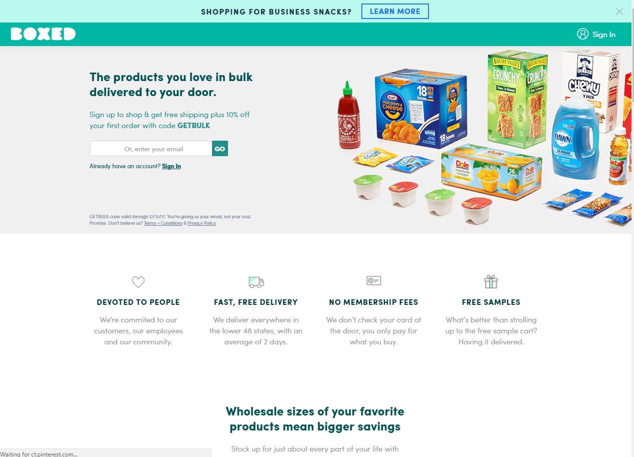
Boxed
Boxed is the best example for a wholesale e-commerce website, I’m not a big fan of Alibaba’s design even though it is one of the most successful websites in this category.
Boxed is one of the finest which is the reason it’s on our list.
Moving on boxed has a long scrolling home page, which pretty much sums up the whole purpose of a website, the page is white and it is really pleasant to your eyes, they played the coloring part with the text.
Clever isn’t it?
Desertfortwo
Desert for two is an amazing food website, you are greeted with amazing pictures of deserts and yes try not lick your screen JK!
The photography on this website is amazing, a perfect example which shows how to display your product on a website!
The page starts with a huge logo then links to the social networking platforms they are available, followed by categories and other features and rest of the page is filled with their detailed photos of products. Desertfortwo it is!
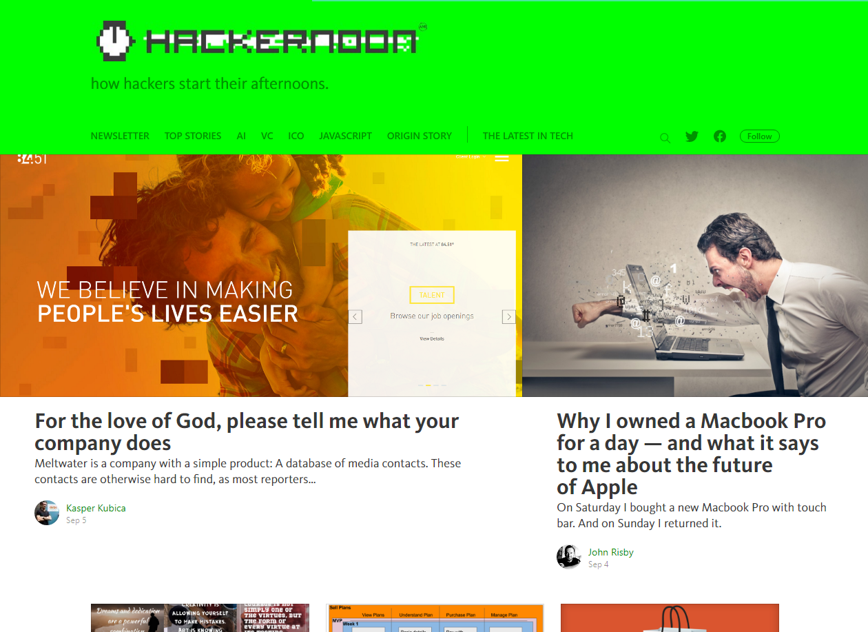
Hackernoon
Hackers are cool so is this website, the logo is a pixelated font from the 90’s game theme, followed by the links to various categories and links to social media platforms.
It looks messy but its good kind of messy, I personally like the messy feel but it still holds everything in place and very user-friendly Hackernoon
FutureLearn
Future learn is an E-learning website, in other words, a website for online courses, the first thing you see is a really interesting question in a big font “What would you like to learn?” and a button to guide you through the list of courses they offer.
Great use of content and the whole page has white spaces which makes it really elegant and cool in some ways. I love the content on this website, it hits the bullseye in guessing what a user might be thinking. Go take a look at FutureLearn.
The Outline
Okay, this is the last one in the list, and it’s my favorite of them all. Won’t be talking much about it, you have to see it for yourself. But yes just to let you know, The Outline is New York-based digital media company which shares its views on business, politics, culture, and future.
The website is absolutely stunning, it’s the most vibrant website I’ve come across in recent times. Here’s the link to Outline.
Okay, I’m aware I spoke a lot about white spaces earlier, have you ever come across a website with a video in the background? If you didn’t know, Yes!
You can put a video in the background. Video and motion graphics production is generally more expensive than still images, which is why it’s sometimes overlooked as an option.
But between stock videos and low-cost video production equipment, it’s more of an affordable web design than before.
If your business is a bit more complex to be displayed in a picture or if you think the video is a better option for your website, you should definitely give it a try.
Before you do that there are a few things you need to keep in mind.
Keep the length short
Don’t just post a movie out there, typically this type of video length is around 10-30 seconds, but I would say a 15 seconds video should tell the whole story. And yes don’t compromise on the quality though.
Sound control
Provide a volume on and off button, a video without a sound might sound a bit awkward but an option to turn it off will keep the traffic away from closing the tab, and make sure it’s visible.
What kind of sound would you be playing? Probably a soothing music, no metal, please. And if it’s a longer video do put in some voice over which explain your website.
Easy page Loading
A video in the background obviously makes a website heavier, you cannot lose your website traffic just for the sake of a video.
A video in the background can be compromised for the sake of faster loading of the page.
Quality Video
The quality video doesn’t mean if it is HD or something lesser, yes a HD video makes the page look amazing, but the video should serve its purpose.
The quality video doesn’t mean if it is HD or something lesser, yes a HD video makes the page look amazing, but the video should serve its purpose.
You can either shoot your video or purchase it, it needs to convey the message. Hey! Have we discussed how your background pictures make sense? I guess not.
Never overlook the importance of a background image, while you might think of them more as just an element to ass interest rather than a powerful storytelling tool, you don’t really need a video to tell a story.
Images can certainly tell their own story or reinforce the story you’re already conveying with other content.
Using background images that rotate or change depending on the purpose of the page adds an extra dimension of liveliness to your site.
The more “Lively” your site feels the stronger the impression you leave.
How can you speak with your images?
Well, you don’t have to create custom images to create an impact on a visitor. Generally speaking, custom clicked pictures are always better than what you find on the internet and they specific to your story and will always have a greater impact.
Of course, it is a costly affair, hiring a professional photographer and then the editing part will be a bit heavy on your budget, but hey the impact you’re putting with these pictures will always profit you later.
Another great way to tell a story is stock illustrations, they are very much affordable than a photo shoot, although they’re often too generic to effectively tell a story.
Creating a website which gives a great experience is not an easy task, but you can certainly design all the elements by thinking in their point of view.
You need to draft your idea and make sure you are following all the elements discussed above. Although it is easy to be lost in the design process, you can always take a deep breath and think from the user point of view.
If you need someone to help you with designing your dream Web application project, NMG is someone you need to consult. They have created some breathtaking website. Feel free to take a look at their portfolio.
If you're working on a design for your website, make sure you follow or consider these vital principles of web design to secure the first impressions.
Nishtha
Nov 30, 2012
Get notified on new marketing insights
Be the first to know about new B2B SaaS Marketing insights to build or refine your marketing function with the tools and knowledge of today’s industry.


 The look of the home page is welcoming with good use of white spaces and warm pictures which would create that excitement and enthusiasm for every traveler.