Web Design
We create visually appealing, responsive web designs that captivate visitors and boost engagement. From static layouts to interactive prototypes, we hold expertise across different industry verticals.
Mobile Design
Our team of experienced designers creates sleek, intuitive designs optimized for smartphones and tablets. Our strategic approach to UX/UI mobile design is user-centric. From the initial wireframes & prototypes to the final interface, we at NMG Technologies strive to create a UI that can be effortlessly navigated on small screens.
Mobile Versions
NMG Technologies builds a dedicated mobile version of websites and desktop apps with streamlined layouts that offer offline functionality and custom personalization. Doing so optimizes digital products for mobile operating systems.
User Research
Our user interface design software agency employs a methodic study of buyer persona for your industry - their needs, budgetary requirements & pain points. We then integrate these insights to deliver impactful, user-centric design opportunities that resonate and engage your target audience effectively.
Wireframing
Under our wireframing services, we create detailed blueprints to establish the structure and flow of design solutions that reflect user needs and meet business objectives. Our decade-plus expertise enables designers to spot opportunities to identify usability constraints and improve the overall user experience.
Testing
We perform detailed usability tests to assess product performance and identify overlooked design flaws. This gives us vital insights into how well the design works and how to resolve issues if found.
-
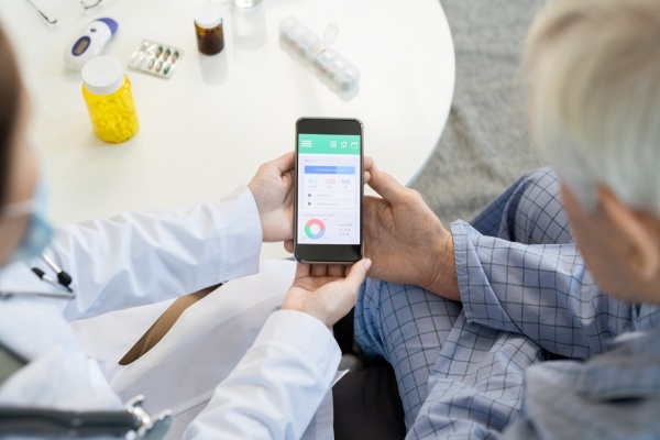
 Healthcare & Medical
 -
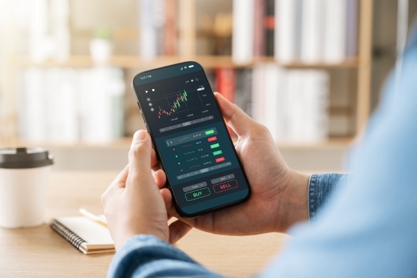
 Fintech
 -
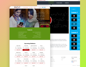
 Edtech
 -
 Travel and Hospitality
 -
Real Estate
-
Logistics and Automotive
NMG Technologies provides global healthcare businesses with expert user interface design services by creating aesthetically pleasing, user-centric websites.
This encompasses web designing for online pharmacies, telemedicine platforms and patient portals like Yew app & MeDoFi.
Our user interface design company builds secure, user-friendly interfaces for fintech platforms that boost trust and engagement.
Avail of our custom services to build a reliable & secure experience for financial transactions.
Partner with us to create interactive edtech solutions that enhance learning and boost student involvement with personalized dashboards and Learning Management Systems (LMS).

We set up stunning, user-friendly websites and mobile apps for travel and hospitality businesses and help them attract customers with visually captivating web experiences.
Our custom user design interface services include payment system integration, interactive scheduling, responsive design and more. This enables our clients in the hospitality industry to deliver the best online experience to the target audience.
We create dynamic, visually stunning websites and mobile apps to showcase properties and boost real estate transactions.
We transform online browsing into captivating buyer experiences with user-friendly property listing portals, custom CRMs, and immersive web & mobile designs with an effective UI/UX.
Our team of innovative designers creates powerful websites and mobile apps for the logistics and automotive sectors to enhance operational efficiency and deliver intuitive UX and mobile-responsive solutions.
Our user-friendly designs boost functionality and utilize modern aesthetics that captivate and engage your audience.

-
Frontend
-
Frameworks
-
Tools
-
 Backbone.jsThis lightweight JavaScript framework is suitable for building single-page applications with a focus on modularity and maintainability.
 -
 Angular.jsThis powerful JavaScript framework is ideal for building dynamic web applications.
 -
 HTMLThis is the golden standard of markup languages for creating the structure and content of web pages.
 -
 CSSThis is used to control the presentation and visual appearance of HTML elements on web pages.
-
 BootstrapA comprehensive CSS framework with pre-built components for rapid web development is preferred.
 -
 SkeletonThis lightweight and minimalist CSS framework is used to create responsive layouts focusing on simplicity and flexibility.
 -
 Semantic UIWe use this UI framework that uses human-friendly class names to make your HTML more readable and maintainable.
 -
Pure.CSSThis small, responsive CSS module fits well into any project without issues.
-
 Adobe XDThis dynamic tool by Adobe is fantastic for designing, prototyping, and sharing user experiences in web and mobile apps.
Sketch: A powerful vector-based design tool for web and mobile UI/UX, it is celebrated for its user-friendly interface and rich plugin ecosystem. -
 SketchA powerful vector-based design tool for web and mobile UI/UX, it is celebrated for its user-friendly interface and rich plugin ecosystem.
 -
 FigmaA cloud-based design tool for real-time team collaboration, Figma is ideal for crafting interactive prototypes and ensuring a smooth handoff to developers.
 -
 InVisionAn all-in-one platform for digital product design that helps us integrate and collaborate on design prototypes.
"NMG is my sigh of relief. Finding an SEO agency, you can trust to create data-driven, Advanced SEO and Content Marketing strategies while staying focused on your unique business and achieving the desired results is rare. The personal attention they give to our projects and their ownership over the results help us fulfill our mission to enable every person on Earth to travel freely."

Mohak Nahta
CEO and Founder, Atlys Inc
CEO and Founder, Atlys Inc
“If you are looking for a company that truly cares about your business and your success, look no further than NMG. Their team is knowledgeable, trustworthy, and committed to delivering results that exceed expectations.”

Mihir Trivedi
Head of Marketing
Head of Marketing
“NMG Technologies provided a detailed specification document and appropriate software solutions from the outset, delivering results very close to the original proposal. The team was available to discuss issues, replied promptly to emails, and provided constant updates.”

Sai Karan Vedulla
London & Partners,
VP & Chief Representative
"What set NMG apart from other companies was their experience in managing complex programs and their strategic insights in the B2B segment. They did an excellent job throughout the whole project and provided a level of assurance and comfort in their abilities that others could not match"

Steve Delvecchia
VP Digital Engagement,
Resources Connection Inc.
(NASDAQ Listed)


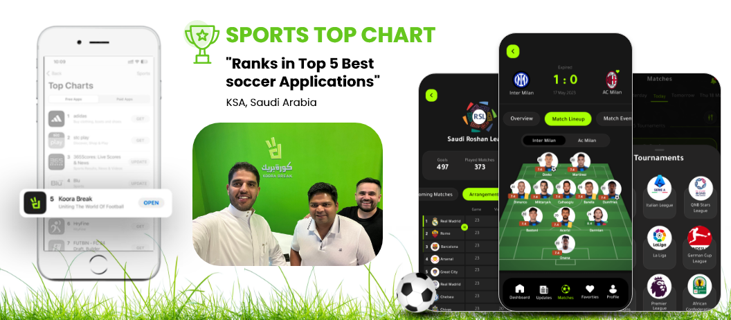
Never Miss a Goal with Koora Break!
Developed by NMG Technologies, Experience Football Like Never Before with Saudi Arabia's Award-Winning Soccer App.
February 23, 2024
Read More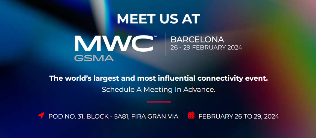
NMG Technologies to Participate in Mobile Word Capital Barcelona – the world’s largest and most influential connectivity event
NMG Technologies to Participate in Mobile Word Capital Barcelona – the world’s largest and most influential connectivity event
February 16, 2024
Read More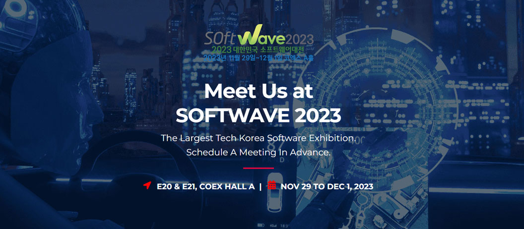
NMG Technologies Participated in Softwave 2023, The Republic of Korea Software Exhibition
NMG Technologies Participated in Softwave 2023, The Republic of Korea Software Exhibition
November 29, 2023
Read More